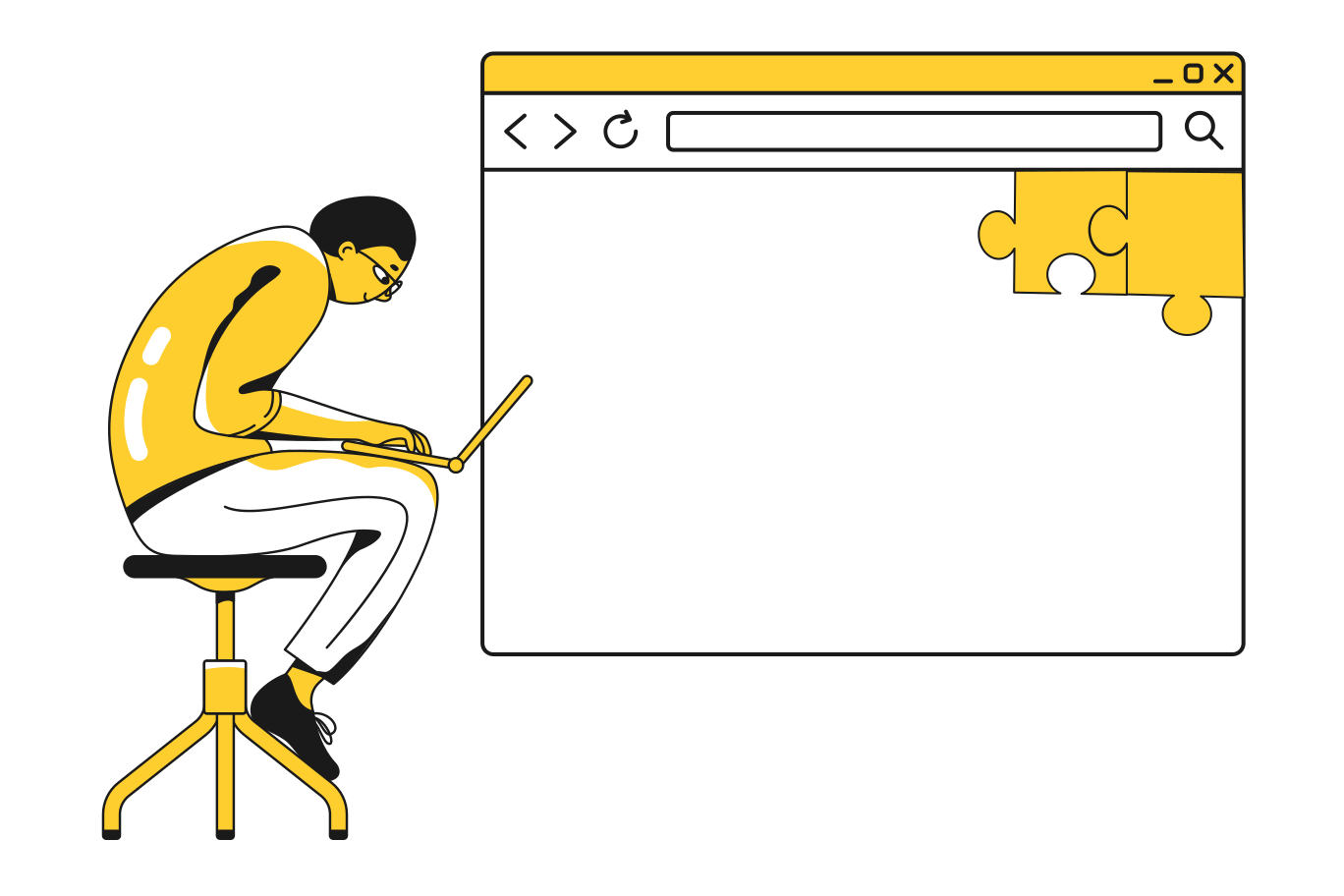
Responsive Web Design
Beautiful Responsive Websites That Adapt To A Changing Browsing Landscape
A responsive website design is extremely important in this day and age because of the amount of people using different devices to gain access to the internet. The way a website is displayed on a desktop or laptop is different from the way it’s displayed on a mobile phone, so just having a non-responsive type can make it difficult for visitors to view it. Years ago there were websites that were set up specifically for use with mobiles, but visitors could still visit the desktop sites. The problem with doing this is the fact that in many cases it had to be moved from left to right to read each line of text. Understandably that lost businesses sales from people that wanted to use their mobiles when out and about.
How A Responsive Website Can Increase Your Potential Sales
As we provide responsive website design in the UK, our clients website visitors do not have that problem. They can visit a site on their desktop and visit the same on their mobile devices with the same usability. Some households don’t have laptops or desktops at all which means their only source of visiting is via their mobiles. This can mean websites losing out on a lot of potential business.
Better Usability On Mobile Devices With A Responsive Website
With our specialist approach to responsive website design, you’ll never miss out on a customer again. Whatever device they use they will be able to get to the page they want to without any fuss. Everything from text content to images will be relative to the size of the screen and device capabilities to make it easier to switch from one to another. A responsive website is created by using automatic resizing, so you don’t need to have separate sites to suit each device, after all there are a lot of them out there now.
Research has shown that over 50% of website traffic comes from mobile devices. Whether a person makes a purchase now or later on, at least they will have the opportunity to view the service or product you have to offer. Think about the amount of time most people spend commuting, searching the web during lunch breaks and just while waiting around. It makes sense to create sites that can adapt.
Increase Your Search Engine Ratings With A Responsive Web Site
If a person has found a site they like and copied the address, they won’t be disappointed when they use it on their mobile device. Responsive website design in the UK is one way you can bring your website up to date and relevant to the modern web user. It has become so popular that Google has even made site ratings higher for those that can be easily used from other devices. Most people now own a mobile phone that is capable of searching the internet, people of all ages. It’s not just a trend device. It’s become a common way of keeping in touch, running businesses and viewing websites, so why not take advantage and step up your game to have the upper hand on those that haven’t caught up yet?
Why not say hello
Whatever your challenge, we would love to talk to you about it.